This is a great example where the production and knowledge of printing techniques are enhancing a printed piece delivering a full enhanced experience and ultimately conveying a feel of luxury and value to a branded piece of marketing material.
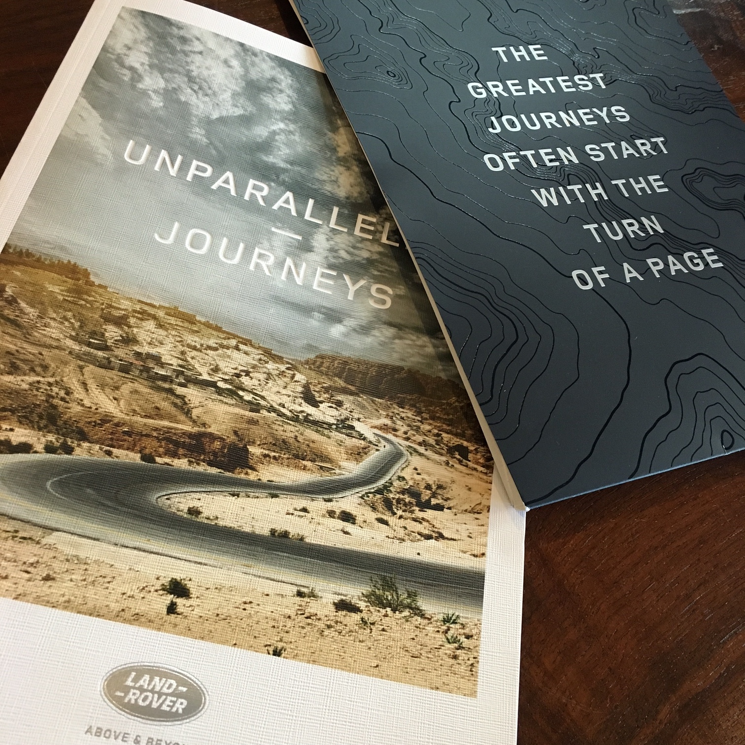
This Land Rover direct mail piece comes as a booklet featuring the 17 best scenic drives in the country wrapped with a sleeve. Although the design itself is simple and classic, it turns out to be exceptional with the help of the finishing and printing treatment applied to it. It is an example of how working with a design expert will make the difference from a low-cost - limited-knowledge one. In this very case, the piece itself fully transposes the feel of luxury of the car brand as well as the adventurous and rugged part of the experience and leaves the reader with the desire to go out on the road and drive on an adventure.
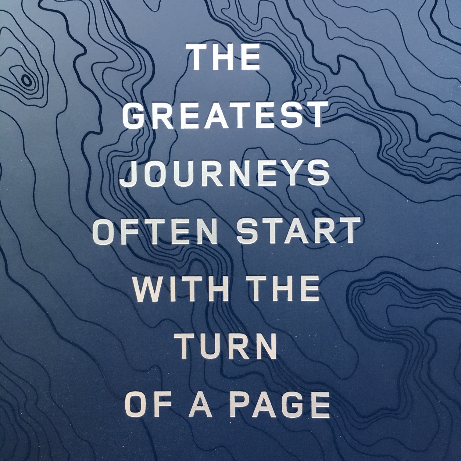
The piece itself has been produced with a combination of finishes and printing techniques that are a great enhancement to this piece. The sleeve itself has been printed with a double hit of Pantone to increase the depth, the richness of the color then matte laminated, the altitude lines of a topography map has been treated with a spot UV gloss varnish contrasting with the matte lamination and finally, the text overlaying has been foil stamped in matte silver with a debossing effect.
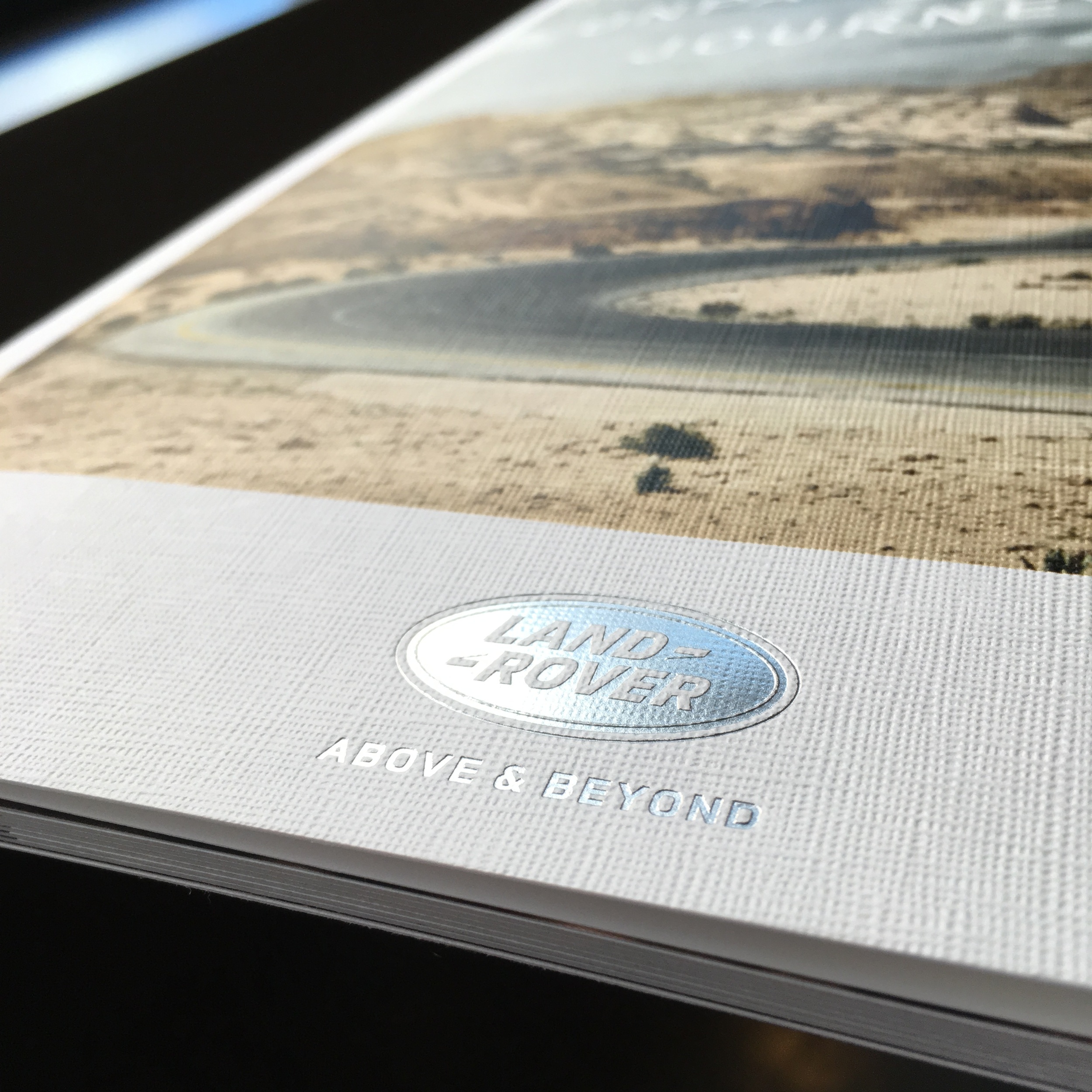
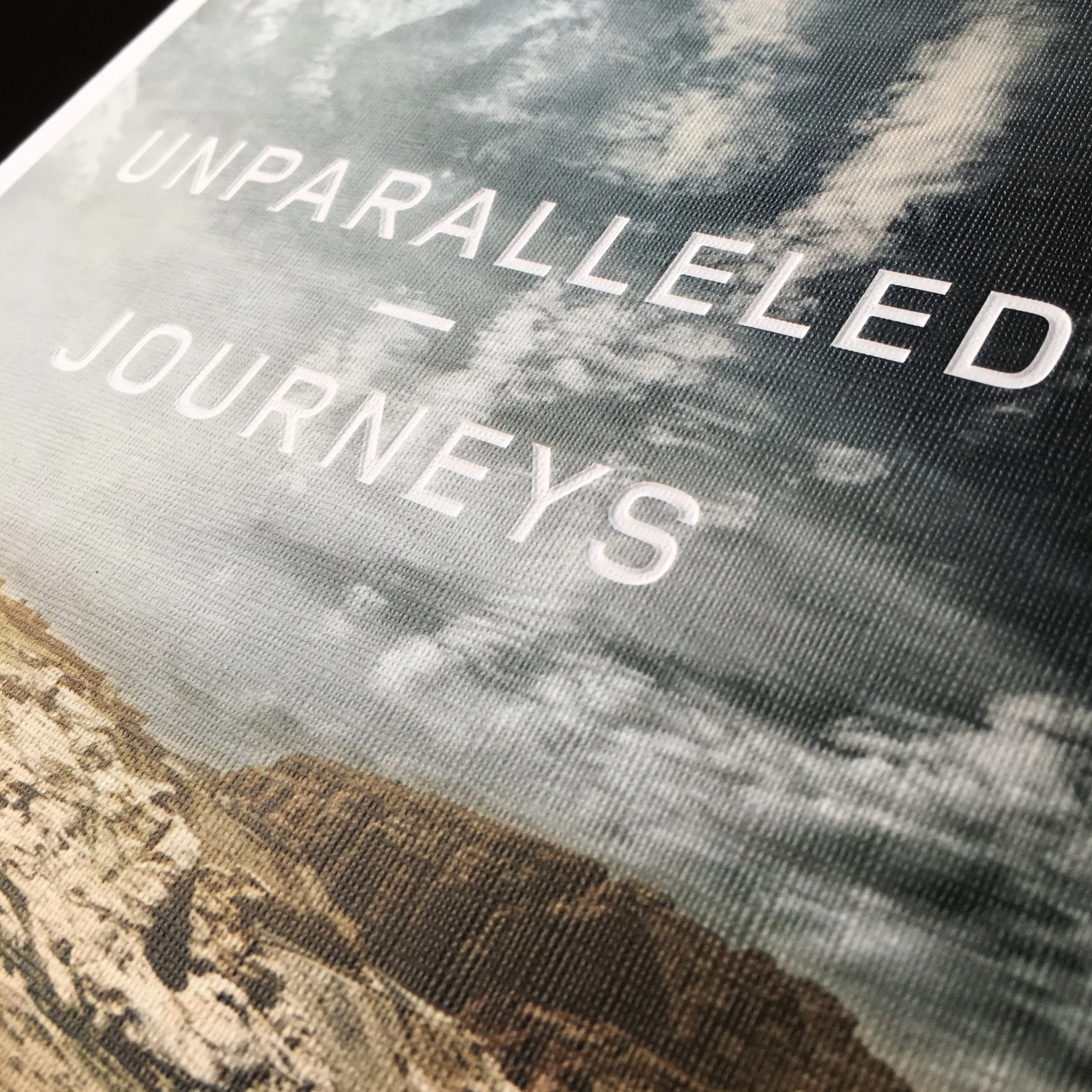
The Brochure cover is printed on Gmund Paper, one of the best paper manufacturers in the world (they are also used for the Oscars' invitations and envelopes). The visual is a 4 color Pantone process, while the logo has been both embossed and debossed with a silver foil stamping treatment. The headline itself is debossed with a beveled treatment. The image itself of dramatic clouds of a winding road with a perspective and the four-color Pantone treatment and contrast created with unconventional colors immediately draw in the reader and invite him to turn the pages, as if invited to go on an adventure. Overall, a gorgeous job.
