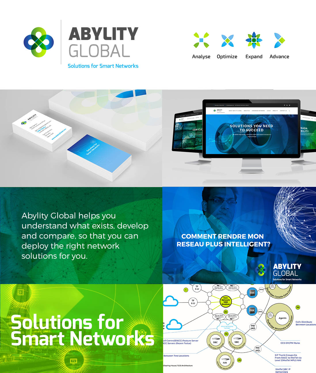
Brand and businesses are in perpetual motion. The market changes and so do customers demands. Abylity was built on the premise of providing analytics while simplifying the RFP process within the telecom and network industries. Seven years later the organization finds itself shifting towards international markets with an increased demand in custom designed networking solutions for large enterprises and retail organizations with multi-layers of technology integrations. Our process included industry and competitive research which allowed us to define a look and feel for the brand that could instantly convey professionalism, modernity and could speak to multiple audiences.
The new icon symbolizing the complexity of such networks and its multi-layering components as well as a double infinite loop alluding to the always on characteristic of a performing network solution. Furthermore, we explored deconstructed alternatives that could also be associated with the specific process the brand is focusing on.
A set of imageries directly related to the targeted audience as well as key striking visuals are combined with rich overlays of the brand colors.


